
Overview
Create a unique mobile travel app following iOS and Material Design guidelines. The focus will be odd and obscure pop culture touristy stuff.
Credits
The general objective was provided by the client. The creative direction including the concept for the content, the name of the app and the logo is my own.
Purpose and context
Create an app that features listings of tabloid type Tourist attractions in the U.S. This will be a travel app for people who love visiting strange, kitschy locations in the United States. This app will catalog the attractions, their locations, maps and directions, and nearby amenities.
Objective
To design iOS and Android versions of the Travel app.
Approach
The Project Proposal
App Name:
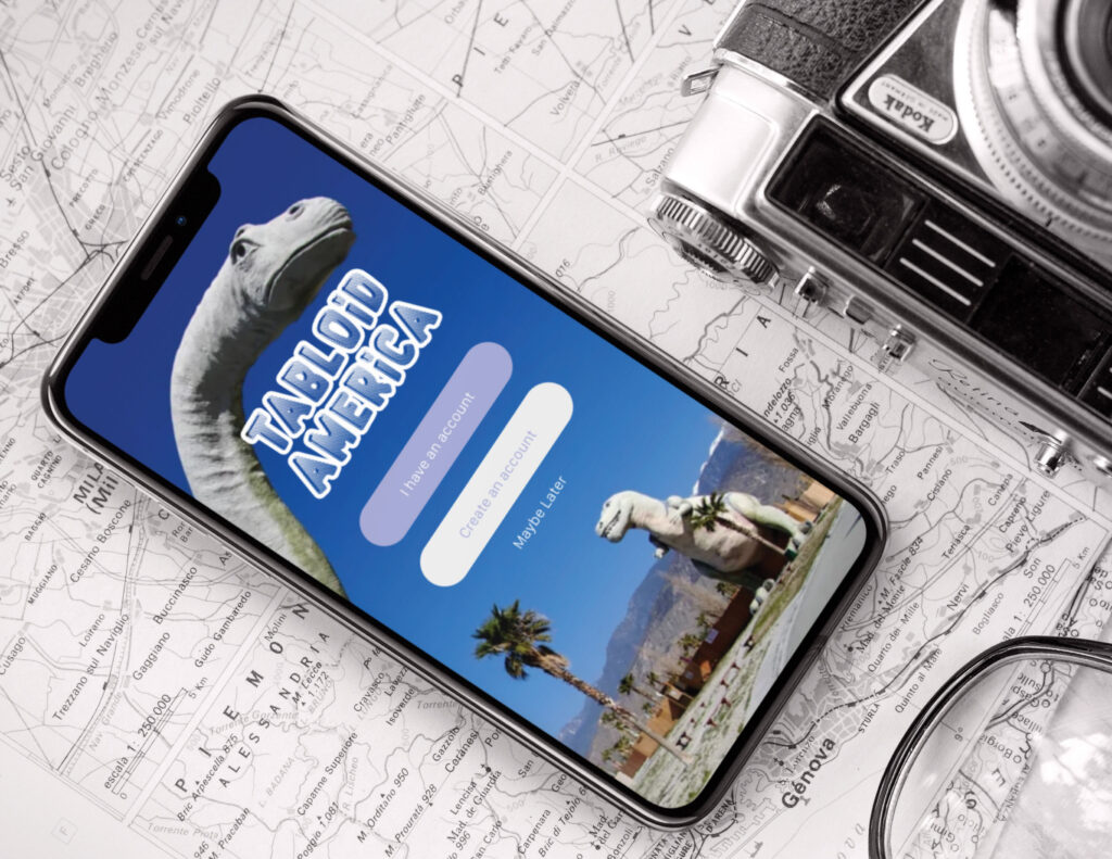
Tabloid America
Objective:
Cataloging and listing tabloid type tourist attractions in the U.S. The app is not for booking trips or lodging.
Context:
This will be a travel app for people who love visiting strange, kitschy locations (like Graceland or South of the Border on I-95). This app will catalog the attractions, their locations, maps and directions, and nearby amenities.
Weird U.S. and Atlas Obscura are two websites that could be considered competition, but they did not have mobile apps in the apple app store.
Right now it stands out because there are no other travel apps like it in the app store dedicated to weird tourist destinations.
Users:
People who enjoy odd and obscure pop culture touristy stuff.
Key Features:
Listings by state.
Listings by city.
The ability to search for a list of attractions by state, city or zip code.
The ability to search for an attraction by name.
Photo and brief description of attractions, hours,
fees, etc.
Maps, directions and nearby amenities.
Creating Userflows.
User Story 1:
Person wants to find odd tourist type attractions within driving distance of their home.
Log in/Sign up –> Search options –> Browse options near you –> List of attractions within selected radius (miles) –> Attraction
User Story 2:
Person is planning a trip and wants to find odd tourist attractions along the way.
Log in/Sign up –> Search options –> search by state(s) –> List of attractions within selected state(s) –> Attraction
User Story 3:
While traveling, a person hears about local oddities and wants to find more information about them.
(Like a mobile version of tourist brochures found at rest stops and roadside diners).
Log in/Sign up –> Search options –> Search by city or name of attraction –> List of closest matches –> Attraction
Initial wireframes.
Based on the user stories 1-3.
Android vs iOS.
Assessing the differences.
Android – notable attributes.

Based on Material Design guidelines.
Small screen size 360 x 640.
Type – Roboto.
Elements have shadows to showcase elevation.
Bottom navigation built in – back button at bottom.
Categories displayed on cards.
Hamburger menu for side navigation.
Button style – more square, raised with text all caps.
iOS – notable attributes.

Based on iOS Human Interface guidelines.
Small screen size 375 x 812.
Type – San Francisco.
Elements are flat – no shadows.
Back button at top.
Categories displayed as a list.
Navigation options on bottom tool bar.
Button style – more rounded, flat with text upper lowercase.
Evaluating design patterns / trends.
Android vs iOS.
Android
Navigation

Top hamburger menus on android.
Data Management
Settings drop down indicated by three vertical dots on android.
Gathering Input
Keyboards appear on pages below boxes for
text input.
Search filters for Destinations near you appear as drop downs under hamburger menu to the left of the text box.
Data Management
Android settings drop down under the
hamburger menu.
Misc
Location icon on map.
Material Design GPS icon in destinations near you text input box on Android.
iOS
Navigation

Bottom navigation icons on iOS.
Data Management
Settings drop down indicated by a gear icon on iOS.
Gathering Input
Keyboards appear on pages below boxes for
text input.
Search filters for Destinations near you appear as drop downs under hamburger menu to the left of the text box.
Data Management
Categories on iOS device appear as icons on bottom navbar.
Misc
Location icon on map.
Mid Level wireframes for userflow #1.
Android Screens

IOS Screens

Having a look at the competition.
Culture Trip
Travel inspiration, planning and booking – all in one app. Get inspired by exciting insider travel stories and tips from around the world, and closer to home. Book unique experiences, hotels and places to stay – wherever you are, wherever you go.
Roadside America
App includes 1 region you choose from 7 oddity-rich U.S./Canada regions. Purchase more ($1.99/region) or all remaining regions ($6.99). The roadside attraction gurus at Roadside America have spent decades exploring the weird, amusing wonders of America’s highways. The app puts that expertise at your fingertips for your own adventures. Fun reports, maps and photos guide you to less traveled places waiting just off the next exit.
Roadtrippers
Roadtrippers’ Android and iOS road trip apps make it easy to plan your summer road trip with friends or find an amazing place nearby you never knew existed. You’re always 5 minutes away from something awesome!
Setting up the basic structure.
Looking at primary screens, secondary screens, and edit screens.

Thinking about haptics and gestures.
Sounds and physical feedback.

Another round of user testing.
Tabloid America App prototype Comments.
Android Version
Tracey – UI Designer and her Husband Eric
Both T and I give this a thumb’s up. The closest thing to a criticism we can muster (this is more from T) is maybe the branding could use more emphasis.
Matt – Student
Good layout.
I don’t think it’s necessary to create a whole new screen for the search bar. (Search Destinations By Name Screen).
Good layout. Easy to understand and clear. (Home Screen).
Leeya – Student
(Home page) The search bar was the first thing I noticed- the shadow here may be a little too heavy. Other than that really like the layout and the visual hierarchy.
Think it’ll look good to see the outline o the stars. (Destination Roswell Page).
Keyboard looks great but usually the numbers are on their own separate line. (Login page).
iOS Version
Carol – Health Care Professional
I wonder if you want a search criteria by topic/name, like Moth Man or Area 51?
The flow makes sense to me. Very Easy to follow.
Leeya – Student
Browse Destinations near you – the alignment is slightly off here (I think she means keys on keyboard).
Maybe here it could have the maximum distance.
Nathalia – Student
The “selected” section on bottom menu could maybe have a stronger colour? Just so it’s more evident. (City or State screen with listings).
Very nice! Like that you’ve added a like button and review, those are great features.
I would maybe review the leading on the copy. (Close to you Foamhenge page).
I didn’t quite get what is the “maybe later” function. (First screen).
Final Android Screens

Final iPhone Screens

Challenges
Sorting through design patterns and trends to find the ones I thought worked best for the app. Found various solutions through web research, and referencing Material Design Guidelines and iOS Human Interface Guidelines. Creating realistic mockups of people using the app. Found Placeit.net to be a great resource.
Takeaways
Overall, I feel the project successfully accomplished it’s objectives.
To improve the app, I would add an area where users could offer suggestions for attractions to add. Also, I would include sections with specific themes such as places to see on Route 66, or oddities of (pick a region), etc.